
Treasure Keepers
The Secret of The Treasure Keepers was officially released yesterday, and I’m thrilled to share some insight into the illustration process of this exciting book by A.M Howell and Usborne Books. Set in 1948 during the aftermath of the Second World War, the story is a moving tale of courage, friendship and buried treasure! As a former archaeologist and also an enthusiast of the 1940s, the subject matter was a delight to immerse myself within - I couldn’t have asked for a more inspiring project to work on.

As with all projects, the process begins with research. I love this stage as it’s full to the brim of potential ideas, sparks of vision-making, and gaining new-found knowledge about the subject. I like to design my reference images into mood boards so I can quickly access the visual imagery. It’s extra work, but it’s worth it. I can be working on other projects at the same time, so putting together a folder on my desktop with all my references makes the process less stressful and more streamlined. Below you’ll see images of ‘land girls’ who wore the most brilliant uniforms while working hard on farms across Britain during the war years. The main character Ruth (who wears the red jumper on the cover) was asked to be clothed in a similar outfit, but something a bit more young - hence the shorts.


The story references archaeological finds such as the Hoxne Hoard which is the largest hoard of late Roman gold and silver to be found in Britain. It includes rare and curious objects such as an ‘Empress’ pepper-pot figurine, who I drew for one of the chapter heads. When I was an archaeologist, I drew many ancient finds for cataloguing. These illustrations were precise scaled drawings, shaded with hundreds of tiny ink dots. My style of illustration is obviously now very different when working in children’s publishing, and it was a nice experience to draw more freely and personally while still drawing objects from the ancient past.
As well as referencing images from online or books. I also have my own collection of printed ephemera which I have collected since a very young age. My collection of old envelopes, postcards and postage stamps all proved valuable when drawing some of the chapter heads. I love illustrating these kind of objects as there’s quite a bit of detail involved with them.

Due to the moorland location of the story, the imagery for the cover - and throughout the book - was full of flowing grasses and rushes. The undulating movement of grass is also a great way to convey movement and energy in the scene, which is windswept and somewhat desolate - the perfect place to bury treasure! As always, my messy first sketch is usually in red pencil as it’s what I’m comfortable and confident with. For some reason it allows me to ‘see’ the image more clearly without heavy or dark lines. I then move on to a darker ink/washes of watercolour to fill out the scene and ‘perfect’ the imagery to a more finished standard. This is the sketch or ‘rough’ which is then passed on to the art director for feedback. There were more changes made along the way as certain things were changed in the brief, and as you can see from the final book cover, the farmhouse was moved to the back cover instead.

The colour roughs went through a few colourways to see what suited best. As you can see, colour can really change the mood and atmosphere of a cover. The cover art also had to work well with the previous books in Howell’s series, so a more saturated colour palette was considered, with a hopeful yellow sky. I used my own temporary lettering to fill up the space in the centre which I used as a guide to illustrate around. The final lettering was designed in-house, and was foiled in beautiful gold. The addition of gold foil for the title and treasure was such a lovely touch, and works well with highlighting the subject matter also.
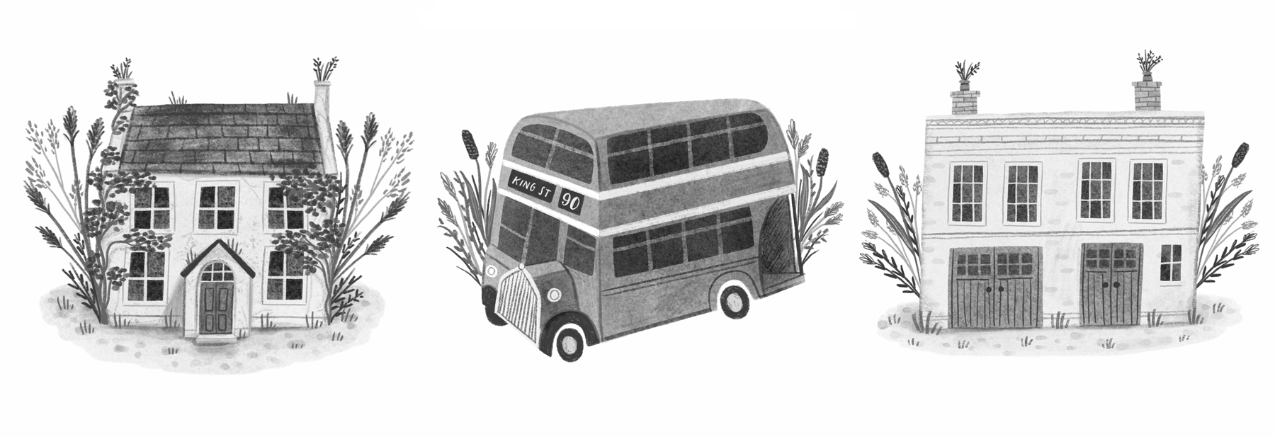
Here’s some of my favourite chapter heads I illustrated. I added a variety of flowing grasses to each image to create a consistent visual narrative to all the images. The interior illustrations are in greyscale, which I love working in. Strangely enough, I find a limited palette gives me more confidence, and I like the challenge of working with only a few tones and highlights in this case. You can see a few more interior images here in my portfolio.

Above is an image I shared on my Instagram page on publication day - March 31. It’s quite gratifying to see the final shiny product next to the sketches and drawings I created long before I knew what the finished book could look like. It’s always a proud moment to physically hold and thumb through a book I illustrated. I am a lifelong book lover, and moments like these make me feel like I may just be living in a childhood dream of mine…..but yes, it is my career, and one which I’m so thankful for.
Check out the videos below to see inside the book, and there’s also a fun look at how the cover art went from sketch to final artwork (without all those pesky working hours involved!). I hope you enjoyed reading a bit about the process of working on this wonderful story. Happy reading! ~ Rachel x